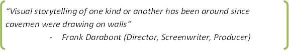
A picture is worth a thousand words but numbers tell the story

When it comes to actually seeing the data – the patterns and what it actually means – there are two popular terms in data science right now: data visualization and data storytelling.
What is data visualization and how can I do it?
Go ahead and do an online search for “data visuAn email has been sentalization” and you will mostly get analytics and BI tools in your results. You will also find numerous sites that tell you the “top 7” or the “top 20” or the “22 free” data visualization tools out there. The fact is, there are a lot of tools available to visualize data right now. Tableau is probably one of the leaders but it can get pretty expensive. It can get pretty fancy too. But what does data visualization actually mean?
In simplest terms, data visualization just means turning data and information into something visual. That simple bar graph you can do in Microsoft Excel or Google Sheets is an example of data visualization.
Infographics are also a good form of data visualization. Most people don’t think of them when they think of analytics – since they are pretty and artistic – because data and math can’t be creative and pretty right? Not true. Nevertheless, let’s think of what infographic really means. Information + Graphics. Pretty self explanatory. And there are so many cool ones out there that take a lot of data and turn it into something easier for the human eye to process.
One I found interesting was the infographic on Warren Buffet’s Empire. It’s kind of big and messy but then again, so is his empire I guess. Then of course, there are the infographics about infographics. Inception anyone?
Regardless of the tools or techniques you use, companies are now hiring graphic designers and artists to help build beautiful visualizations of data. For example, Dark Horse Analytics in Edmonton, AB specializes in visualization, employing people they refer to as “Information Designers”. Last month I attended a meetup where they presented a model they built for fire and emergency services. Let me tell you, their station locator was functional, easy to understand visually, and had a lot of data behind the scenes powering that model.
Why is data visualization important?
Have you ever heard of the saying “a picture is worth a thousand words”? If so, then that’s really the essence of why visualizing data is important. Humans process the world visually so why not make it easier to process data in a visual context?
In an article from 2014 from the science and technology company, Thermopylae, they draw on research from MIT and the University of Minnesota to say that the “human brain processes images 60,000 times faster than text, and 90 percent of information transmitted to the brain is visual”. So, if human beings are wired to process things visually then the best way to find patterns and understand trends in data is to make it as visual as possible. I also discussed this in a previous post on creating useful visualizations.
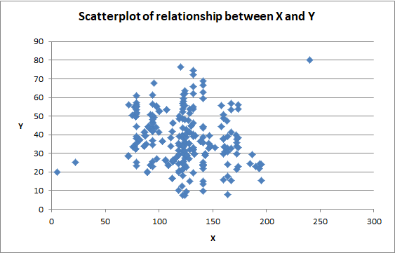
Furthermore, data visualization makes it easier to spot trends and patterns, or even data that doesn’t seem to belong or fit the average trend (referred to as outliers). It would be almost impossible to spot outliers in larger data sets but doing a scatterplot can often quickly point them out. As can be seen in the scatterplot below, there are clearly 3 outliers in this mass of data points. These would be harder to detect if all you had was the data table.
So, when you think of data visualization, think of making data more presentable, digestible, and just plain prettier for your audience. There are loads of tools out there to help. If you’re just starting out, play with spreadsheet programs and even free tools and apps you can find online.
And once you make that data look good, you can focus on what the numbers are actually saying.
Data storytelling
Storytelling is more than just a visual of data.
Some might believe that throwing a bunch of graphs or even a good infographic into a slide deck tells the story. Or showing a bar chart that goes up and to the right shows that a business is doing well. Unfortunately, reality is rarely this simple.
Data storytelling is about connecting the dots for people, making sense of what all the visualizations mean together, and providing actionable insight from the data. Many people – oftentimes people who are scared of numbers and Math to be honest – think that data and numbers are black and white and there is only one way to interpret them. Just as with any good story, data can have different perspectives too.
In all honesty, I have some issues with the term “storytelling”. It makes me think of people who spin a yarn to their own advantage. And let�’s be honest, that happens a lot with data. Some people think their “gut instinct” is better than what the facts are showing. Or maybe the data doesn’t exactly support the idea they are selling. So data is sliced in a way that makes the numbers tell the story they want.
Even changing the scale of a graph can make small variances look optically massive. And using a graph and data in ads tends to lend credence to the message a company is trying to convey. For example, Chevy used the ad below to tell the story that more of their trucks were still on the road compared to other brands.
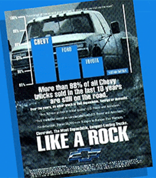
But look at the scale on the bar chart. The scale starts at 95%. So, while it is true that around 98.2% of Chevy trucks were still on the road, about 97.4% of Ford and 96.5% of Toyota trucks were as well. But the scale of the graph makes it look like only half as many Toyota trucks were still on the road compared to Chevy. In actuality, it was less than a 2 percentage point difference. Now, let me be clear that this ad is still telling the truth; however, it is the way in which it is selectively presenting the information that is misleading. They chose the data as well as the visualization to tell the story they wanted.
Now, let’s put this information into a different perspective. All this ad shows you is the percentage of trucks still on the road after 10 years by only some of the truck brands. There might be other information but if so, it’s buried in the fine print. For the sake of this example, let’s pretend these percentages apply to just one year of sales and instead of using percentages we determine the actual number of trucks still on the road. I apply the percentages from this ad to some 2014 sales numbers.
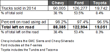
From this “what-if” example, although Chevy might have the highest percentage of trucks still on the road that would only represents about 38% of the total trucks on the road from these 3 brands. In fact, the Ford F-series trucks represented over 53% of trucks sold in 2014. And even if we apply the percentage of trucks still on the road from the ad, we see that the overall proportion of Ford trucks on the road is still by far the largest.
But this is not the story Chevy wants to tell. And of course, the site from which I took the 2014 sales data might not be the “undisputed” source of all truck sales data. Nevertheless, the fact that how the data is sliced could lead to such different results tells me that this is where real data storytelling is important.
While data can be used to tell stories from a certain perspective, another way to look at it – as I prefer to do – is that good data storytelling is about what the data actually means and not what someone wants it to mean.
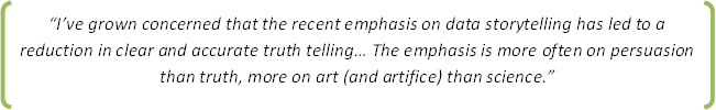
Of course there will always be uncertainty and interpretation when it comes to data but as Stephen Few, a seasoned veteran in the field of data visualization and storytelling, said in his March 21, 2018 blog post:
To be a good data storyteller and to prevent misinterpreted data and visualizations, humans experienced in data interpretation still need to be involved. Machines are great at crunching the numbers, finding patterns, and even predicting the future. Maybe one day they will be good storytellers too but until then human beings are still needed to explain the why behind the data and what actions you should (or should not) take.