Wherefore are thou, data visualization?

In my last post on spreadsheet formatting, I discussed the importance of making data in a spreadsheet accessible to users by using some simple formatting techniques. In this post I will discuss no matter how well data is formatted, sometimes it just needs to be visualized.
Using the same sample data from my last post, this is what the final table looked like:
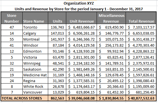
The table is sorted in descending order by the Total Revenue column. By looking at the first and last stores you can see that the Toronto store makes more than 10 times the total revenue of the Vancouver store but what about all the stores in between? Where do they all fit? And what about units? Can we see anything about the relationship between revenues and unit sales? This becomes a little trickier to do with just a table of values. In this case, a visual representation would be much better to help truly compare each store to each other.
Here is an example of a chart created in Excel using the data above
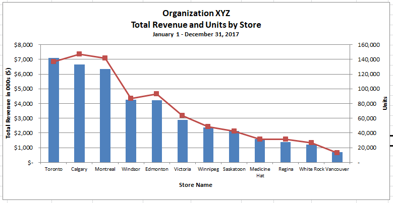
This is a dual-axis graph with the primary vertical axis being total revenue and represented by the blue bars and the secondary vertical axis being units and represented by the red line.
Before I get to the usefulness of this visualization, I will point out two problems and why I still chose to use this format.
- The first problem is that the red line representing units should not actually be a line because it is representing nominal/categorical data. In this case, the points on the line should not be joined because the data in between the points does not actually exist. I’ve chosen to connect the points because not only does it make the dual-axis graph a bit easier to read, it also makes the pattern a bit easier to spot.
- The second problem is that a dual-axis graph can be a bit confusing. What data is being read off the primary vs. secondary axis? The organizations for which I worked have almost always had a bit of an unwritten rule about these graphs. Bars are read off the primary axis and lines off the secondary axis. As a result, if your audience knows this, the graph will make sense. If they do not, make sure you explain it before talking about the data.
Now, back to my original point, why is this data visualization better than the table of values provided earlier? Didn’t that table look pretty good with all it’s formatting and neatly organized data? Perhaps, but what it was missing was the ability to quickly spot the patterns. But I saw the patterns almost immediately in the table, you might say. Then you are pretty good with pattern recognition, I would respond. Unfortunately, most people don’t like data as much as we do and giving them something visual makes the data easier to understand.
One of the things the graph shows very quickly is that the total revenue and units generally follow the same pattern where high revenues usually equate to higher units. For example, Toronto, Calgary and Montreal are by far the highest performing stores in both units and revenue. But what it also shows very succinctly is that although Toronto has the highest total revenue of all the stores, Calgary and Montreal sold more units in the period. As a result, I would then focus my research or discussions on product mix in the stores, possibly the miscellaneous revenue column, or even customer behaviour. For example, does Toronto have more impulse purchases?
The other grouping that stands out in the graph is Windsor and Edmonton. Although much lower than the top 3 cities, they both have around $4M in total revenue and around 90K units. The remaining cities all have less than $3M in total revenue. Once again, it is interesting to see that while Windsor has slightly higher total revenue, Edmonton has clearly sold more units. I would also go back to the table and notice that Windsor has more than double the “miscellaneous revenue” compared to Edmonton and I’d dig into that data a bit further.
Another question I’d have is why is Vancouver performing so poorly in both total revenue and units? It is one of the major Canadian cities and the expectation would be that its performance would be similar to the top 3. In addition, looking at the performance of the White Rock store, which is located in a similar part of British Columbia as Vancouver, some questions regarding the performance of that area will likely need to be discussed.
And all these questions from just one quick graph. Although you could have gotten this information from the table, it almost pops out at you when provided in a visual form. It helps to focus the conversation on store performance – or the why behind the data – rather than make the audience dig out their calculators and pencils trying to understand what the data is saying. And that’s what good data presentation is about; to get to the point of what the data is representing and focus on moving solutions forward.